


When you think about website design for therapists, you probably think about the basics – things like the core pages of a website, quality images, clear call-to-action buttons, and of course the actual words on the pages.
And while those things absolutely matter, they only scratch the surface. Because what’s often overlooked isn’t just what is on your website – it’s how it’s strategically designed and presented.
Your website design isn’t just about how your site looks, but also how it performs – both in search results and in converting visitors into clients. Because after all, that’s the goal, right?!
A well-designed website for your therapy practice should never just be something that’s nice to look at. It should be something that works behind the scenes to help you get found, guide potential clients through your content, and make it easy for them to take the next step.
So if your goal is to have a therapy website that actually supports your practice growth, these design tips will help you do exactly that.
How Website Design for Therapists Impacts SEO and Conversions
Many people don’t realize that your website design plays a major role in your SEO rankings, so before we get into the web design for therapist tips that can help boost conversions, let’s start with search!
What’s important to know is that search engines like Google don’t just evaluate your keywords – while that’s of course a big part of SEO (and is the reason that we constantly talk about doing proper keyword research) search engines are also interested in how users interact with your website. We love using Semrush.
That means things like load speed, mobile responsiveness, page structure, and navigation all play a role in your rankings. But these things don’t just impact your SEO rankings! Allll of these directly impact conversions, too.
Don’t believe us? Just think about it: if someone lands on your website and feels confused, overwhelmed, or unsure where to go next, they’re far less likely to reach out, even if your services are exactly what they need.
A well-designed therapy website, on the other hand, helps:
- Guide visitors through your content naturally
- Build trust and credibility quickly
- Make important information easy to find
- Encourage action without feeling pushy
In other words, good web design for therapists supports BOTH – visibility and connection.
And when those two things work together, that’s when your website becomes a true growth tool for your practice.
Top Website Design for Therapist Tips to Boost SEO and Conversions
Now that we’re clear on how website design impacts SEO and conversion, let’s get into the actual tips to help you improve your therapy website!
Keep Your Navigation Simple and Clear
This might seem like a simple and obvious one, but you’d be surprised at how many websites we see that have a bloated navigation menu and it’s one of the first things we always fix!
Your navigation menu should make it easy for visitors to find what they’re looking for within seconds. This is why we suggest sticking to essential pages like:
- Home
- About
- Services
- Blog
- Contact

Overcrowding your website menu with too many options can overwhelm visitors and make your site harder to use.
Clear navigation will improve user experience (which can directly impact conversions!) and will help search engines better understand your site structure.
Make Your Value Clear Above the Fold
“Above the hold” is a common website designer term and though it might seem technical, all it really means is the portion of your webpage that’s visible immediately without scrolling.
When someone lands on your website, they should immediately be able to understand:
✔️ Who you help
✔️ What you help with
✔️ What to do next
without having to scroll further down!
Strong, clear messaging paired with a simple call-to-action (like “Schedule a Consultation”) right away can significantly improve conversions.
Prioritize Mobile-Friendly Design
As of 2026, mobile devices account for ~60% of global web traffic, which means that if your website isn’t optimized for mobile, you’re likely going to get left behind!
If your website isn’t optimized for mobile, it can lead to slow load times, poor readability, and frustrating navigation – all of which can hurt both your SEO rankings and conversion rates.
Our biggest tips for designing your website with mobile users in mind is to make sure your text is easy to read, your buttons are easy to tap, and your layout adjusts smoothly across devices.
Improve Your Website Speed
Another hugeeee thing that people overlook when designing their website is their page load speed, which again impacts both – SEO and conversions.
If your site takes too long to load, visitors are more likely to leave before they even see your content. And from an SEO perspective, a slow loading website tells search engines that your site may not provide a strong user experience, which can negatively impact your rankings.
To improve your website load speed, we recommend compressing large images, limiting unnecessary plugins, and using a reliable hosting provider.
Use Clear and Consistent Calls-to-Action
Every single page on your therapy website should guide visitors toward a next step, whether that’s booking a consultation, filling out a contact form, learning more about a service, or even reading a relevant blog post.
It’s for that reason that every page needs to feature clear and consistent calls-to-action so that your website visitors never have to guess about what to do next. Instead, they’re strategically guided through a journey that hopefully moves them further into the overall buying process.
For CTA’s to work effectively, they should be easy to find, clearly worded, and consistent across all of your pages.
Tangibly, this can look like:
- making them the same color, ideally a brand color that stands out among the rest
- using clear – not cute – language (like “BOOK HERE” instead of “Ready to chat?”)
- placing them in consistent spots across pages (e.g. top right corner, middle of the page, and at the bottom)
- repeating them multiple times on longer pages so visitors don’t have to scroll back up
- making buttons large enough to easily click on both desktop and mobile
- limiting the number of different CTA options so visitors don’t feel overwhelmed
- pairing them with a short line of context (ex: “Ready to get started?” above the button)
- ensuring they stand out from the rest of your design (not blending in with background colors or text)
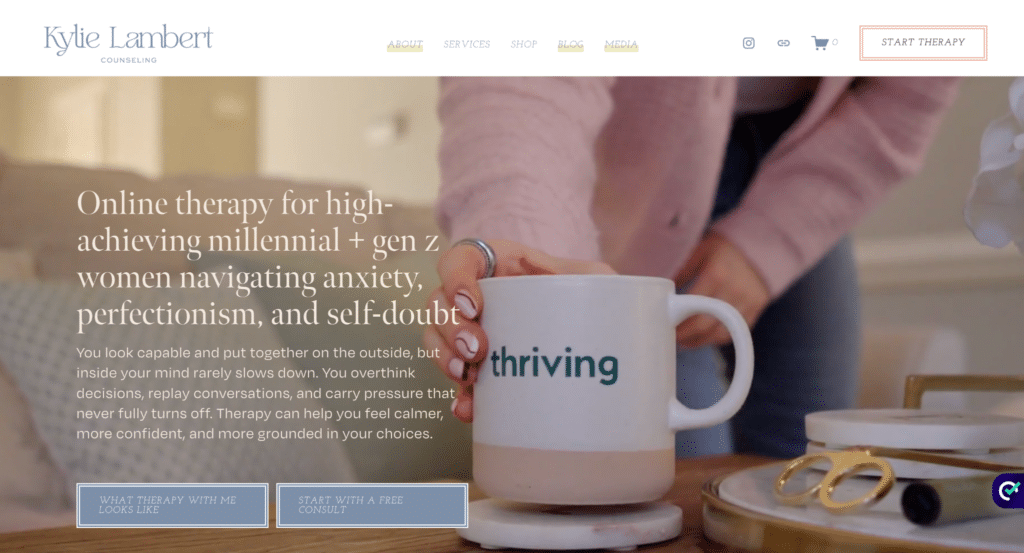
Here’s an example of our CTA’s in action on the Studio Adagio website:
All of these things can remove friction and make it easier for potential clients to move forward.
Structure Your Pages with SEO in Mind
One of the most important things to remember when it comes to your website design as a therapist is that it’s not just about the visuals – the structure of your website is just as important!
Each webpage should include:
- One clear H1 heading
- Organized subheadings (H2, H3)
- Scannable sections
- Strategic keyword placement
This not only improves readability for users but also helps search engines understand your content.
Use Intentional, High-Quality Imagery
An effective website should include both – strategic copy and imagery to help your visitors get a clear grasp on who you are, what you do, and who you help.
But when it comes to the visuals on your website, the goal should be for them to support your overall message – not distract from it! For therapists, this often means using calm, inviting imagery, professional headshots, and consistent brand visuals.
Our biggest tip for this is to avoid using overly generic stock photos or cluttered graphics that can make your site feel impersonal.
Thoughtful imagery on your therapy website can help build trust and emotional connection!
Reduce Clutter and Overwhelm
One of the most common website design mistakes is trying to say everything at once.
While we understand that you want to convey who you are, who you help, what you offer, and allll the things, it’s best to focus on clarity by:
- Breaking up text into smaller sections
- Using whitespace intentionally
- Highlighting key information
- Removing anything that feels unnecessary
A clean, simple website design makes it easier for visitors to stay engaged and take action.
Make Your Contact Process Seamless
If the goal of your therapy website is to book more clients, the last thing you want is for someone to have to search for the contact button.
If someone is ready to reach out, don’t make them work for it by having to scroll to the footer to find your email or sift through your services page to find a contact button.
KEEP IT CLEAR AND SIMPLE!
Tangibly, that means:
- Having a short and straightforward contact form (if it takes too long for them to fill out right away, they might not finish it – only ask for what you truly need)
- Offering clear expectations for next steps
- Including a contact button in your main navigation so it’s always easy to find
- Repeating your contact CTA throughout your site (not just on one page)
- Embedding your contact form directly on your contact page (instead of linking out elsewhere)
- Making sure your form works properly (test it regularly!)
- Including a short, reassuring line above the form (ex: “We’ll get back to you within 24–48 hours”)
- Keeping required fields to a minimum (only ask for what you truly need)
- Making the form mobile-friendly and easy to complete on a phone (because remember – ~60% of people make up mobile website usage!)
- Avoiding clutter on the contact page so it feels simple and focused
- Offering an alternative contact method if preferred (like email or phone, if applicable)
Overall, the easier it is to contact you, the more likely people are to do it.
Align Your Design with Your Ideal Client
Lastly, it’s important that your therapy website is truly designed with your ideal client in mind!
That means your colors, fonts, imagery, and tone should all reflect the type of experience your clients can expect when working with you.
When your design aligns with your audience, it creates a stronger sense of connection from the very beginning.
For example, if your ideal client is a busy mom, your website might feel calm, simple, and easy to navigate – nothing overwhelming or overly clinical. Your messaging might acknowledge how full her days already are, and your calls-to-action might emphasize ease and flexibility, like simple scheduling or low-pressure next steps.
On the other hand, if your ideal client is a young professional navigating burnout, your design might feel a bit more modern and structured, with messaging that speaks to performance, pressure, and finding balance.
The goal with your web design as a therapist isn’t to appeal to everyone – it’s to make the right person feel like, “This is exactly what I’ve been looking for!”
Custom Website Design for Therapists
At the end of the day, your website isn’t just about aesthetics – it’s about strategy. And while these website design tips can go a long way, the most effective websites are built with intention from the ground up!
If your current website feels outdated, hard to navigate, misaligned with your services, or not bringing in consistent inquiries, it may be time for more than small updates!
At Studio Adagio, we specialize in custom website design for therapiststhat blends thoughtful design, strategic copywriting, and SEO best practices (because they all work together!), so your website doesn’t just exist – it WORKS!
We have various custom website design packages, so you can choose the one that’s best fit for your needs at the time.
So, if you’re ready for a therapy website that supports your visibility, reflects your expertise, and boosts rankings and conversions, we’d love to meet you! CLICK HERE to get connected.
And if you’re simply searching for more therapy website resources? We’ve got you covered there too: